It's quite often for me to plot out the statistical data while training machine learning models. E.g., teaching models to play games.
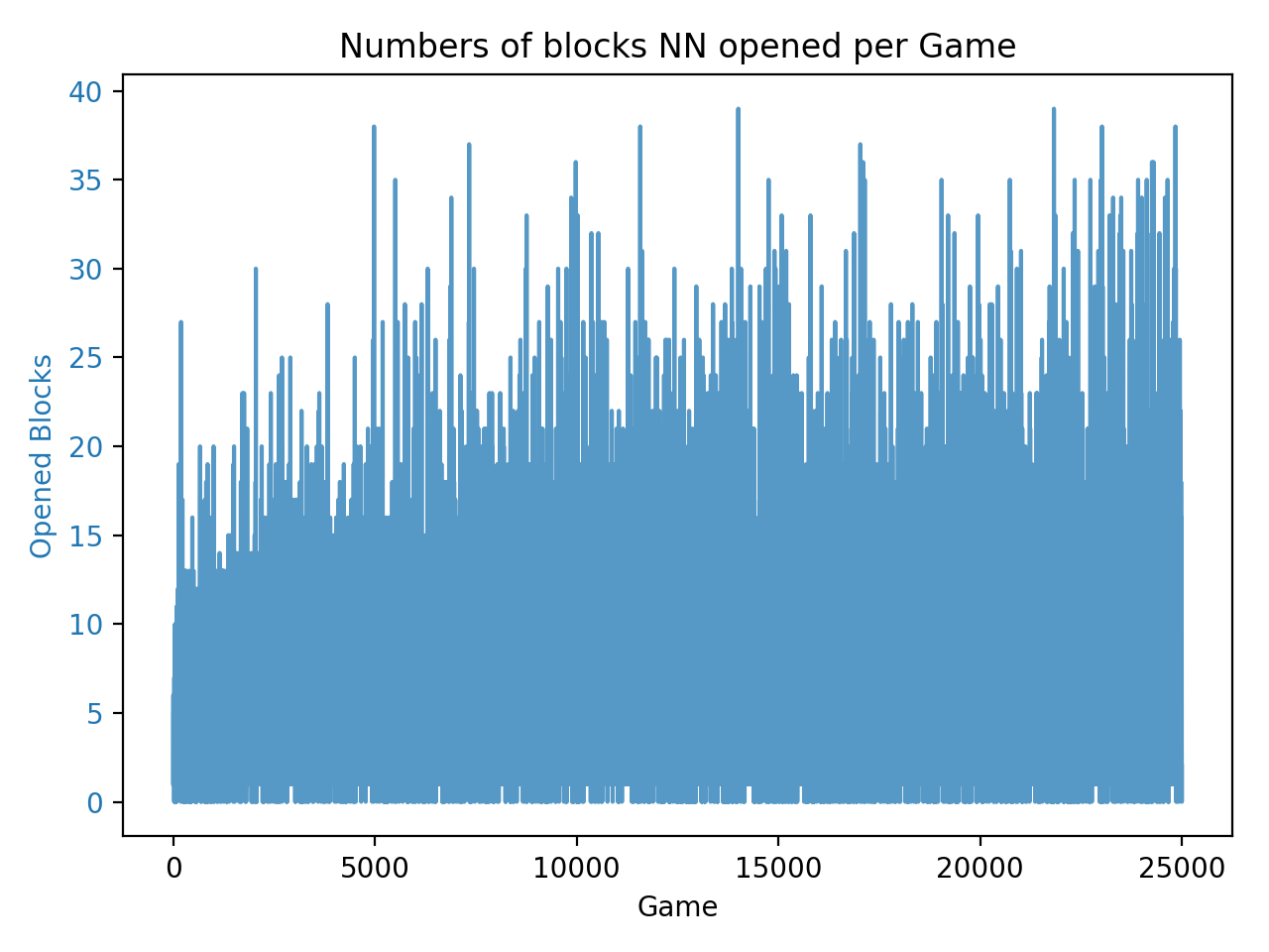
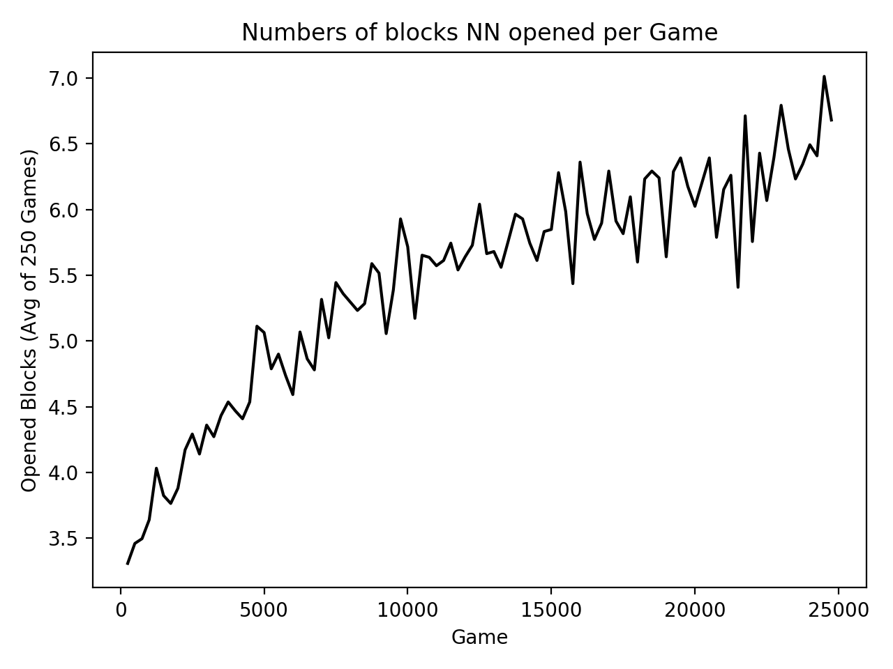
As the records increase, the chart becomes crowded as well as difficult to see how the line grows. Therefore, a strategy come up that only plotting out the average of each 250 records in a chart.
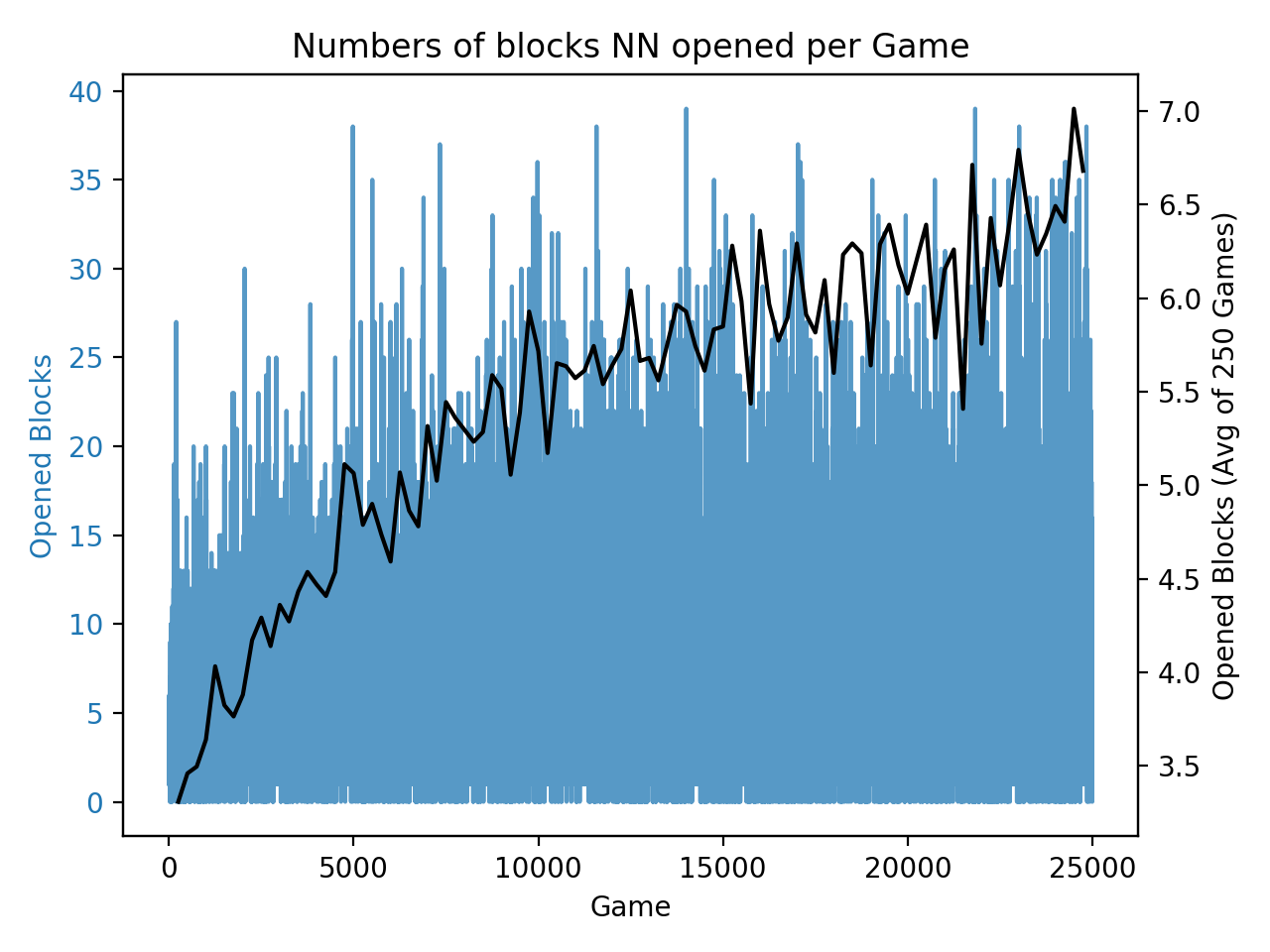
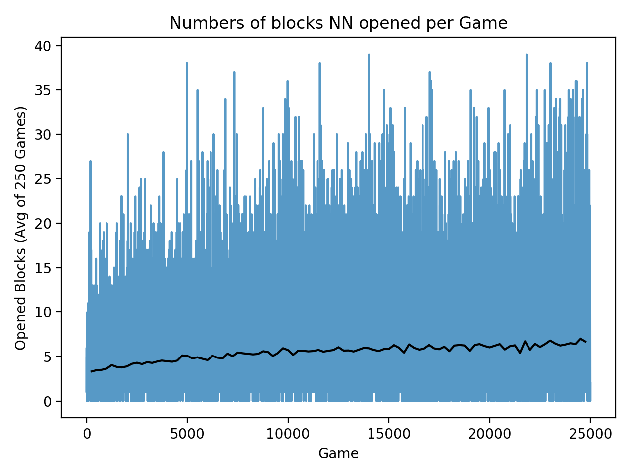
Not too bad, but can we combine the two chart together? After doing so with plt.plot(), we notice that the fluctuation of the latter dataset is much flattened due to being zoomed out with the range of y axes.
Therefore, The more appropriate approach is to create two subplots with each of them containing one dataset. In this way, two subplots will have their own scales independently and thus not affecting others.
fig, ax1 = plt.subplots()
plt.title('Numbers of blocks NN opened per Game')
plt.xlabel('Game')
ax2 = ax1.twinx()
The codes above will create our first subplot and set up the title as well as the x axis label of the chart. In line 4, we generate another subplot called ax2. Back to our first subplot ax1, we feed the records into it by using the codes below.
ax1.set_ylabel('Opened Blocks', color='tab:blue')
ax1.plot(range(len(data)), data, color='tab:blue', alpha=0.75)
ax1.tick_params(axis='y', labelcolor='tab:blue')
Apply the same process to our second subplot with the average of each 250 records this time.
ax2.set_ylabel('Opened Blocks (Avg of 250 Games)', color='black')
ax2.plot([ 250 * (i + 1) for i in range(len(data_avg))], data_avg, color='black', alpha=1)
ax2.tick_params(axis='y', labelcolor='black')
When we finish the steps, we are now able to display our chart with multiple Y axes.
fig.tight_layout()
plt.show()
Pretty neat isn't it.