[Matplotlib] Multiple axes with different scales
It's quite often for me to plot out the statistical data while training machine learning models. E.g., teaching models to play games.
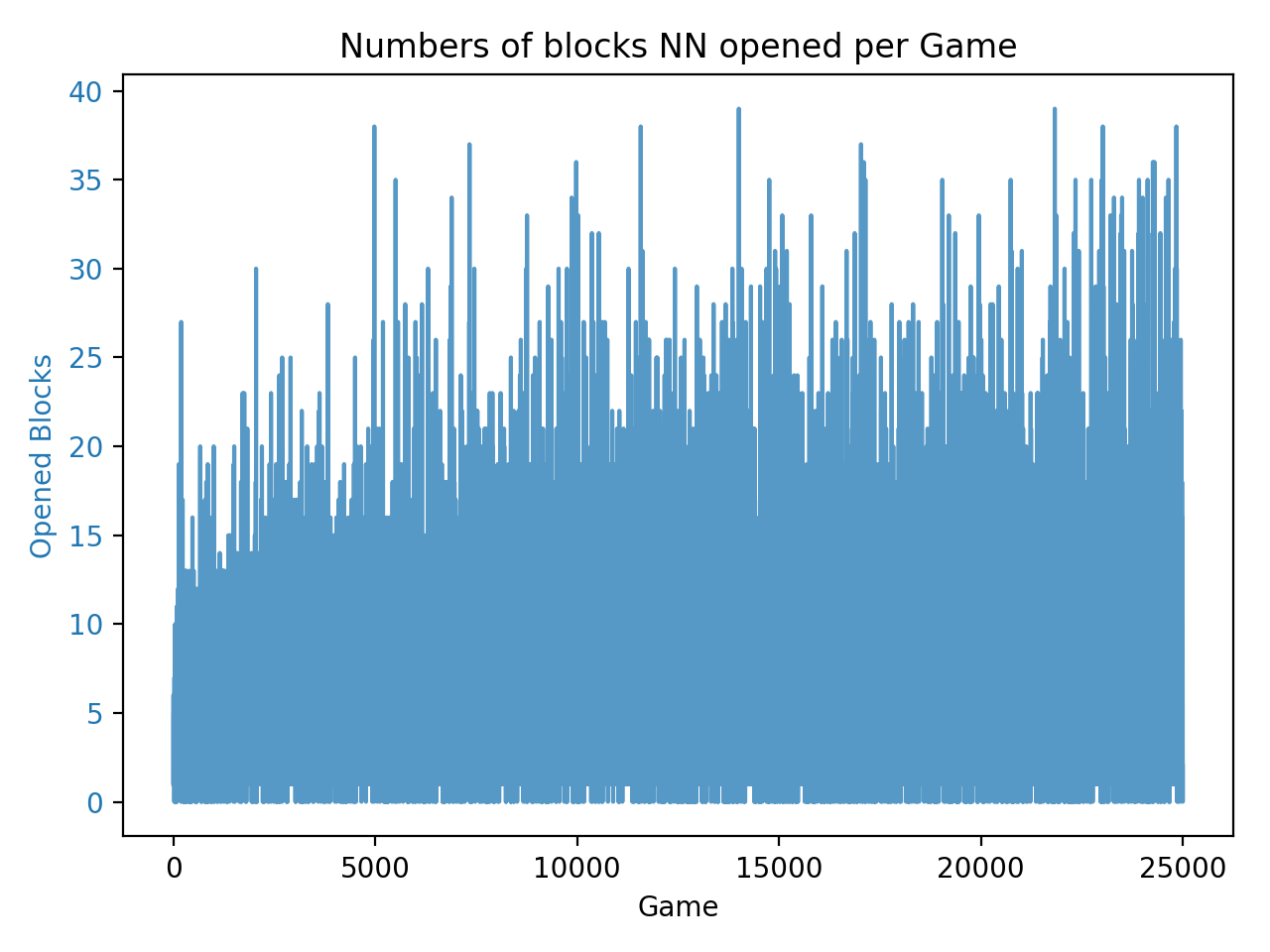
As the records increase, the chart becomes crowded as well as difficult to see how the line grows. Therefore, a strategy come up that only plotting out the average of each 250 records in a chart.
Comments